A data-driven approach to management means making decisions using data analysis instead of just relying on gut feelings or experience. It focuses on using numbers, metrics, and insights from different sources to help make better strategic and day-to-day decisions. Have a listen to our video which tells you a little more about our latest Blog.
Like GPS for Your Business:
- Measure the right things
- Problems become clear
- Solutions become obvious
But What Are the Right Things to Measure?
There are lots of things we could measure but they fall broadly into four categories:
- Income
- Expenditure
- Time Spent
- Quality
These categories are not necessarily in order of importance. You could argue they are in reverse order, in the sense that if you take care of the last two the first two will take care of themselves.
We need to be careful though, so we don’t get into a circular argument: How do we know if our time is well-spent, and our products are good? By measuring our income and expenditure of course! But let’s not get bogged down in metaphysical arguments about the nature of quality.

The categories are in fact, ordered by how easy each one is to measure, as this leads us nicely onto the next point:
Pitfall 1: We measure the things that are easy to measure.
As humans, we tend to measure the things that are easy to measure and then make decisions based on the things we have measured. This is natural and to some extent unavoidable. But if we are aware of the problem, we can take steps to reduce it.
Cracking the Code: Fun with Data
OK, so we have a primary objective: Maximising Shareholder Value
As a modern organisation, we realise we want to increase value in a sustainable way. We are not just about maximising short-term profits. We also want to be profitable in the long term. So, we need to include environmental, social and governance factors in our thinking as well as financial ones, but the principles are the same.
Info Hunt: We’re All Data Detectives
It’s all very well saying we want to maximise shareholder value, but it’s not much help day-to-day. Imagine asking your staff if they have maximised shareholder value today? We need practical, actionable data.
So, we need to take our primary objective and start to break it down. There are three key principles that can help us:
- Pipelining
- The 80/20 Rule
- Outliers
We will look at each of these by way of some examples …
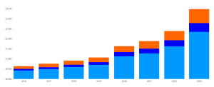
Scoreboards: Games We Play for Business
The first example is from the Income category. We can easily set a target for increasing income, assign responsibility to a team or individual and then measure success. This is all very commonplace, but it doesn’t really help us to improve.
One pathway to improvement is “Pipelining”. We know the overall goal is to generate more income, but we recognise there are a sequence of steps that need to occur for that income to be generated.
Here, we have broken the sales process into a pipeline. We have distinct steps with measurable objectives for each step. Now, we can assign responsibility for different stages of the pipeline to individual team members and monitor results at each stage.
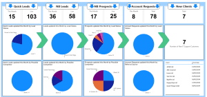
With this approach, we can see at a glance which stages in the pipeline are healthy and get early warning if things start to go wrong.
Suppose our typical customer journey takes 30 days to go from an initial contact to a closed sale. With this window into our pipeline any drop off in initial contacts will show up straight away. We don’t need to wait a month and then see a sudden plunge in new clients. We can act early and put things right quickly.
The Mighty 20: Unleash the Power of the Few
Most of you will be familiar with the 80/20 rule, sometimes known as the Pareto Principle. This is the idea that 80% of the consequences come from 20% of the causes. Whilst this is not a definite mathematical rule, it is widely seen in business:
- 80% of sales come from 20% of customers
- 80% of profit comes from 20% of services
Or put another way:
- 20% of our effort produces 80% of our good stuff
If we can bring to light where this rule is in play, there are huge opportunities. We can do a little bit more of the things that work well and a little bit less of the things that work badly, and progress can be rapid.
For this example, we are going to look at breaking down profitability by Customer and Product. The aim is to identify which of our products and services are most profitable. Then we can start taking action:
- Focus our sales effort on the more profitable products
- Dig deeper into WHY some products do so much better than others
For most businesses, it very clear what we get from sales of each product or service. It can be much harder to work out what each product or service costs to deliver. Even if you simply buy an item at one price and sell at another, you have other costs that need to be allocated across the different products and services.
But this is where the 80/20 rule comes to our aid again. We don’t need to work out the exact cost of every individual sale. It would be ideal if we could, but maybe we can get 80% of the way there with 20% of the effort.
The important thing is to not be afraid to start with a crude approximation. Once the reporting structure is in place, you can refine the calculations to get a more accurate picture over time.
Pitfall 2: People resent being spied on
One of the biggest challenges is tracking where your staff are spending their time. When you tell them “I need to monitor which products and services are most profitable”, they hear “I’m trying to work out who I should sack”. This is a real problem and can only be overcome by getting full participation and buy-in from the team.
As soon as you get to any reasonable level of granularity, you will start to see anomalies in the data that jump out at you. This is where the third principle comes into play:
Spot The Maverick: Unleashing Insights from Outliers
When you first start with a data-driven management approach, you can easily get swamped with data and it is hard to know where to start. Well, one good starting point is to focus on the outliers.
Suppose we create a report on Gross Profit ratio each product line in our range, and we see the following results:
- 90% of products have between 20% – 40% GP
- 6% of Products have > 40% GP
- 4% of Products have < 20% GP
Now we can ask questions like:
- Is the data reliable?
- Are some products genuinely much better than average?
- Are some products genuinely much worse than average?
Maybe we need to start shifting resources towards the 6% of Products that are most profitable and away from the 4% that are least profitable. But before we do so, we need to be sure we are not misallocating costs against the wrong products.
This approach requires a commitment to an ongoing process:
- Approximate
- Investigate
- Refine
At first, you will find lots of areas where the data is wrong, missing or incomplete. But, it doesn’t take many cycles before we start to reveal genuine insights, about what really works and what doesn’t.
Team Fun: A Data-Driven Party
OK, “party” might be overselling it a bit. But I want to return to the idea of turning this into practical, actionable data and this comes down to three things:
- Dashboards
- Reports
- Alerts
You can use any or all of these depending on the urgency and frequency of updates that are required.
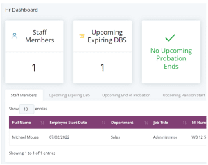
Dashboards
Dashboards are ideal for people who are in the system all day, everyday and need real time data. They can be customised for a team or an individual according to need. Typically, they take the form of counters and task lists that show clearly what needs immediate attention:
Reports
These could be simple lists or more interactive reports like the examples above. They can be downloadable to Excel for further analysis. They are ideal for infrequent, but maybe regular, analysis of historical data.
Alerts
These take the form of Emails, Notifications within the system or via a Teams channel. They are ideal for infrequent events that require immediate attention. There is no need to continuously monitor a dashboard for these infrequent events.
Always Evolving: Let’s Chat about Data
Hopefully, this post has given you some ideas about where you can start on your data-driven journey. Discuss it with your team, find out what insights they feel would be helpful. Then take it from there. To book a chat with one of our team – Contact Us